Representing Data in Physics
In physics, data is often represented using tables, graphs, and formulas.
These tools play a crucial role in organizing, analyzing, and presenting scientific findings. Let’s explore how each of these methods is applied in practice:
These are just a few of the techniques commonly used in scientific analysis.
Note: In broader terms, particularly in statistics, data can be presented using a wide range of graphs and tables, depending on specific analytical and communication needs.
Tables
Tables are used to systematically organize and display raw or processed data. Columns represent variables, while rows show their corresponding values.
Practical Example
When studying uniform linear motion, you might create a table like this:
| Time (s) | Displacement (m) | Velocity (m/s) |
|---|---|---|
| 0 | 0 | 10 |
| 1 | 10 | 10 |
| 2 | 20 | 10 |
| 3 | 30 | 10 |
In this example, the constant velocity is evident both in the data and in the calculations.
Graphs
Graphs offer a more intuitive way to visualize relationships between variables, making the data easier to interpret.
There are various types of graphs, each suited to different contexts:
- Cartesian graphs
Illustrate the relationship between two variables. - Bar charts
Ideal for comparing discrete quantities. - Scatter plots
Useful for representing experimental data with random variation.
Example
Let’s consider uniformly accelerated motion with an acceleration of 2 m/s².
First, collect the raw data and arrange it in a table:
| Time (s) | Displacement (m) | Velocity (m/s) |
|---|---|---|
| 1 | 2.0 | 2 |
| 2 | 8.0 | 4 |
| 3 | 18.0 | 6 |
| 4 | 24.0 | 8 |
| 5 | 50.0 | 10 |
| 6 | 72.0 | 12 |
| 7 | 98.0 | 14 |
| 8 | 128.0 | 16 |
| 9 | 162.0 | 18 |
Next, plot the data pairs as points on a coordinate plane to create a graph.
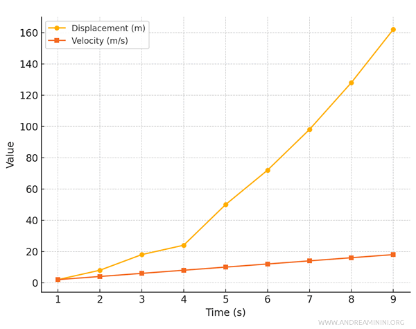
Here, the displacement vs. time graph takes the shape of a parabola, while the velocity vs. time graph is a straight line with a positive slope.
Formulas
Formulas encapsulate the relationships between physical quantities, enabling both theoretical calculations and descriptions of observed behaviors.
Example
For uniformly accelerated motion, displacement \( s \) is calculated using the formula:
$$ s = v_0 t + \frac{1}{2} a t^2 $$
Where \( v_0 \) is the initial velocity, \( a \) is the acceleration, and \( t \) is time.
With \( v_0 = 0 \) and \( a = 2 \, \text{m/s}^2 \), you can create the following table:
| Time (s) | Displacement (m) |
|---|---|
| 1 | 1.0 |
| 2 | 4.0 |
| 3 | 9.0 |
| 4 | 16.0 |
| 5 | 25.0 |
| 6 | 36.0 |
| 7 | 49.0 |
| 8 | 64.0 |
| 9 | 81.0 |
Finally, plot the data points to visualize the trend on a Cartesian diagram.
And so on.