Visualizing Data
Visualizing data through tables and charts makes it easier to read and interpret statistical information.
Raw data from a statistical survey are often difficult to understand.
That’s why it's better to present the data visually, bringing out the key information or insights hidden within the numbers.
Note. There are various ways to represent data visually (e.g., tables, histograms, pie charts, scatter plots, pictographs, cartograms, etc.). The choice of representation depends on the objective and the specific information you want to highlight.
Here are some common methods of visualizing data in statistics.
Tables
Tables arrange data into rows and columns. Typically, the first column lists the statistical variables, while the second shows their absolute or relative frequencies.
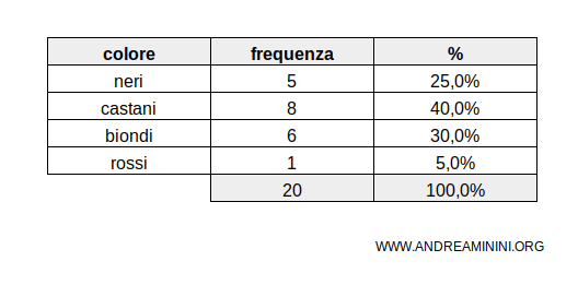
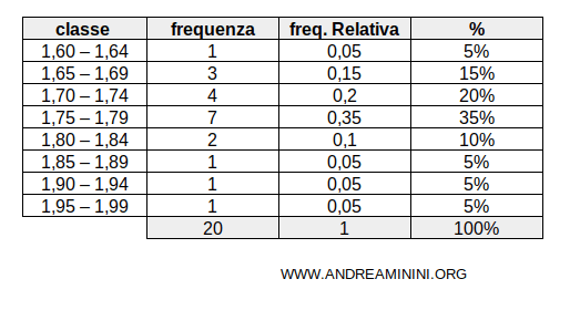
If the variables are quantitative and numerous, it’s useful to group them into classes.
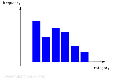
Histograms
A histogram is a common type of bar chart. Usually, the variables are displayed along the horizontal axis, while frequencies are shown on the vertical axis.
It’s frequently used to illustrate the frequency distribution of a phenomenon based on either qualitative or quantitative variables.
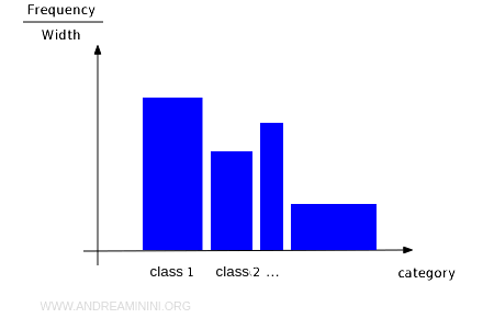
In a histogram, variables can be discrete or continuous.
- For discrete variables, the base of each rectangle is equal. In this case, the histogram is called an orthogram, where the height of the rectangles is proportional to the frequency. A line segment can also be used in place of the rectangles.
- For continuous variables, it's better to group them into classes. Here, the base of each rectangle might differ, and the height is no longer proportional to the frequency. Instead, the area of each rectangle is proportional to the frequency of the variable relative to the total area of the graph.
Orthograms
An orthogram is a histogram where the bars all have the same width (equal-base histogram). The height of the bars represents the absolute or relative frequency of the variable. In orthograms, the frequencies are directly proportional to the height of the rectangles.
Scatter Plots
A scatter plot is a mathematical tool used to show the relationship between two variables. It’s also referred to as the "Cartesian plane."
The plot is formed by two lines, called "Cartesian axes," which intersect perpendicularly at a point known as the "origin" (O).
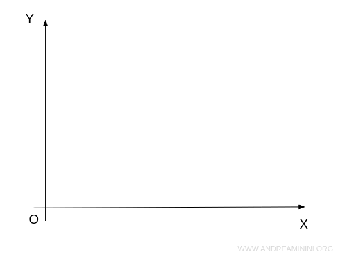
The axes represent two independent variables: the X-axis typically represents one variable, while the Y-axis represents the other.
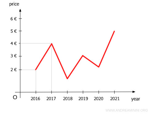
The scatter plot is useful for visualizing relationships between these variables, with each point on the graph representing a pair of values (x;y) in the coordinate system.
For instance, to represent a frequency distribution, you would plot the variables on the X-axis and their corresponding frequencies on the Y-axis.
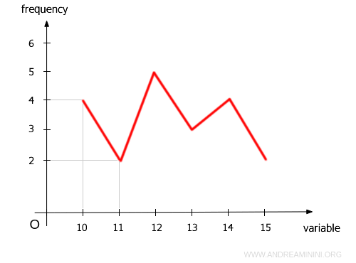
Scatter plots are also useful for visualizing time series and historical trends.
Pie Charts
A pie chart is a circular diagram often used to represent percentage distributions. The entire circle represents 100%, and it's divided into slices, with each slice corresponding to a variable’s percentage frequency. For example, consider this pie chart, which is divided into four sectors.
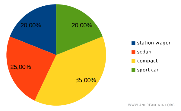
The angle of each slice is proportional to the variable's percentage. For instance, the orange slice represents 25% of the total. To calculate the angle of a sector, use the following proportion: $$ x:360° = 25:100 $$ where 360° is the total angle of the circle. Solving this, the angle is calculated as $$ x = \frac{25}{100} \cdot 360 = \frac{25 \cdot 36}{10} = \frac{900}{10} = 90° $$ So, the orange slice should have an angle of 90°. You can calculate the other angles using the same method.

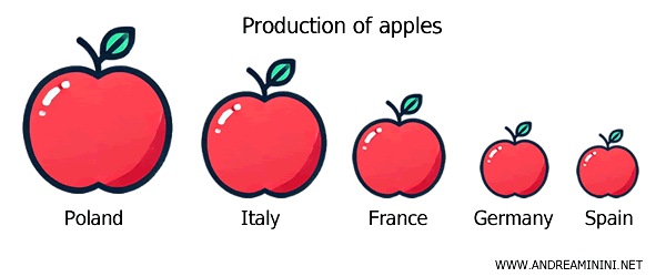
Pictographs
Pictographs are used to visually represent statistical data using icons or images that give an immediate understanding of the data being examined. Each icon is sized proportionally to the frequency or measured data. For instance, to show apple production by country, you could use the image of an apple. The largest apple would represent the top producer, China, while smaller apples would represent other countries, based on their respective production levels.
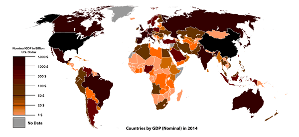
Cartograms
Cartograms are powerful visual tools for representing statistical data in a geographical context, such as countries, regions, or specific areas. They rely on a map of the area being studied and use different colors or symbols to show variations in the statistical values you want to analyze. For example, a cartogram is far more intuitive than tables or histograms for illustrating the global distribution of GDP.
And so on.