Ideograms
Ideograms are visual tools used in statistics to represent quantities or categories in a clearer and more engaging way.
Instead of relying only on numbers or traditional charts like bar or pie graphs, ideograms use symbols or images that directly convey the meaning of the data.
The key feature of these visuals is that their size is proportional to the data, providing an intuitive understanding of the quantities involved.
A Practical Example
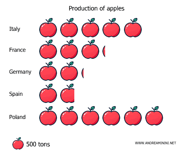
Let’s say I want to show the quantity of apples produced in different countries.
| Country | Production (tons) |
|---|---|
| Italy | 2,500,000 |
| France | 1,600,000 |
| Germany | 1,050,000 |
| Spain | 900,000 |
| Poland | 3,000,000 |
To represent these numbers with an ideogram, I could use apple icons.
Each apple symbol would stand for 500 tons.
Alternatively, I could create an ideogram with apples of varying sizes—small, medium, or large—in exact proportion to the production figures of each country.
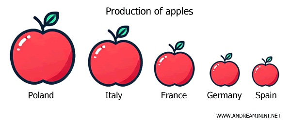
This type of representation not only makes the chart more visually interesting but also allows the viewer to grasp the quantities at a glance.
Rather than interpreting abstract numbers, the observer can intuitively "see" the amount of apples produced in each country.
Pros and Cons of Ideograms
Advantages
One of the biggest advantages of ideograms is their immediate visual impact.
The differences between the phenomena represented are instantly recognizable. There’s no need to read or analyze complex figures. The viewer can easily understand the proportions between the data without having to perform mental calculations.
Furthermore, these symbolic visuals are more attention-grabbing and memorable than a standard chart or data table because they create a stronger emotional connection with the information.
Overall, ideograms can simplify the presentation of even highly complex data, making it more accessible and intuitive.
Disadvantages
However, ideograms take more time and effort to design.
Finding the right symbol for each dataset (e.g., an apple symbol for apple production, a car symbol for car sales, etc.) can be tricky and isn’t always straightforward.
If the proportions between the symbols and the actual data are not maintained, there’s a risk of distorting the meaning and misrepresenting the data.
Note: A common mistake is to represent the symbols on a non-linear scale, such as increasing the area rather than the height, which can distort the perception of the data and confuse the viewer. So, it’s crucial to balance aesthetics with accuracy.
Finally, when there’s a large gap between the highest and lowest values in the dataset, the ideogram might not effectively convey the true proportions.
In such cases, it’s useful to supplement the chart with numerical labels to clarify the proportions or use logarithmic scales, which reduce the differences between data points but make the ideogram less intuitive to interpret.
And so on.