Quantitative Series (Frequency Distribution)
A Quantitative Series (Frequency Distribution) refers to the distribution of a quantitative variable.
In essence, a quantitative series is a table with two columns where:
- the first column lists the quantities (categories).
- the second column shows the absolute and/or relative frequencies, indicating how often each category occurs.
What's the difference between a quantitative series and a statistical series? A statistical series encompasses both qualitative and quantitative categories. Quantitative series, on the other hand, specifically involve quantitative data. As such, quantitative series are a subset of statistical series.
There are two main types of quantitative series:
- Discrete Quantitative Series
A quantitative series is discrete when the quantities are distinct, separate values.For example, the number of students in each class at a school constitutes a discrete quantitative series.
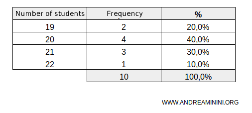
In this example, the school has 10 classes: 2 with 19 students, 4 with 20 students, 3 with 21 students, and one class with 22 students. - Continuous Quantitative Series
A quantitative series is continuous when the quantities can take on any value within a range. In such cases, these quantities are grouped into classes.For instance, the height of students at a school.
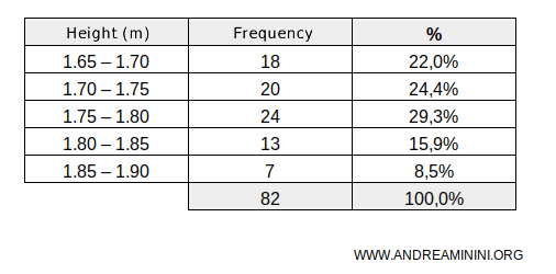
In this example, the school has 82 students, 18 of whom (absolute frequency) fall within the height range of 1.65 to 1.70 meters, and so forth. Height is a typical example of a continuous quantitative variable, where grouping the values into classes allows for a more concise and interpretable representation.
A Practical Example
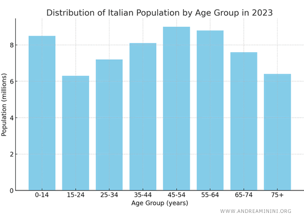
This quantitative series depicts the distribution of the Italian population in 2023, categorized by age group.
Each age group spans a specific range of years and indicates the population size in millions within that range.
| Age Group (years) | Population (millions) |
|---|---|
| 0-14 | 8.5 |
| 15-24 | 6.3 |
| 25-34 | 7.2 |
| 35-44 | 8.1 |
| 45-54 | 9.0 |
| 55-64 | 8.8 |
| 65-74 | 7.6 |
| 75+ | 6.4 |
This quantitative series serves as a valuable tool for analyzing a country's demographic structure, evaluating the impact of various age groups within the overall population, and informing the development of targeted public policies, such as resource allocation for education or healthcare for the elderly.
This distribution can also be visualized with a histogram, providing a clear graphical representation of each age group's proportion relative to the total population.
And so on.