Statistical Series
A statistical series is a collection of data related to a specific phenomenon or variable, organized according to a particular rule or criterion. It's a valuable tool for analyzing quantitative phenomena.
The data in a statistical series can be either numerical or categorical, and they're structured to make comparison and interpretation easier.
Statistical series are generally categorized into two main types:
- Qualitative Series (or Categorical Series)
This term refers to frequency distributions of qualitative or categorical data, where you count how often each category occurs. For example, counting the number of people who prefer different colors (e.g., red, blue, green). - Quantitative Series (or Frequency Distribution)
This refers to a frequency distribution where you count occurrences within specific intervals of a quantitative variable. For example, counting the number of people within specific height ranges (e.g., 150-160 cm, 160-170 cm).
This systematic organization allows for a thorough analysis of the phenomenon, making it simpler to identify trends, correlations, or variations over time or space.
Why Are Statistical Series Important? Statistical series are crucial for data analysis because they help us detect trends, make comparisons, and make informed decisions based on quantifiable information. Visual representations, such as bar charts, line graphs, or histograms, are especially useful for making data more accessible and easier to understand.
A Practical Example
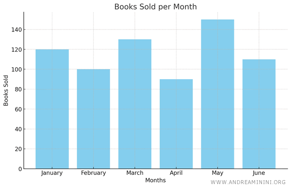
Consider a statistical series that tracks the monthly book sales of a bookstore in 2023:
- January: 120 books sold
- February: 100 books sold
- March: 130 books sold
- April: 90 books sold
- May: 150 books sold
- June: 110 books sold
This is an example of a time series because the data is organized by month.
Each figure represents sales for a specific month, allowing us to analyze sales trends over time.
Visualizing this data in a histogram makes the trend even clearer, providing an immediate overview of the sales pattern.
Types of Statistical Series
Statistical series data can be organized in various ways, depending on the nature of the phenomenon being studied and the objectives of the analysis.
Here are some common types of statistical series:
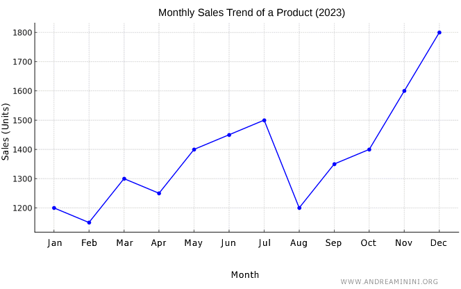
- Time Series (or Historical Series)
Data collected at different points in time to observe the evolution of a phenomenon.Example. This time series shows the monthly sales of a product throughout 2023. Each month is associated with the number of units sold during that period.
Month Sales (units) January 1,200 February 1,150 March 1,300 April 1,250 May 1,400 June 1,450 July 1,500 August 1,200 September 1,350 October 1,400 November 1,600 December 1,800 This time series can be used to analyze seasonal trends, identify peak or low sales months, and predict future sales patterns. These insights are vital for inventory management, marketing strategy planning, and revenue forecasting. The series could also be visualized with a line graph, where the horizontal axis represents the months and the vertical axis represents the number of units sold, making it easy to observe sales trends over time.
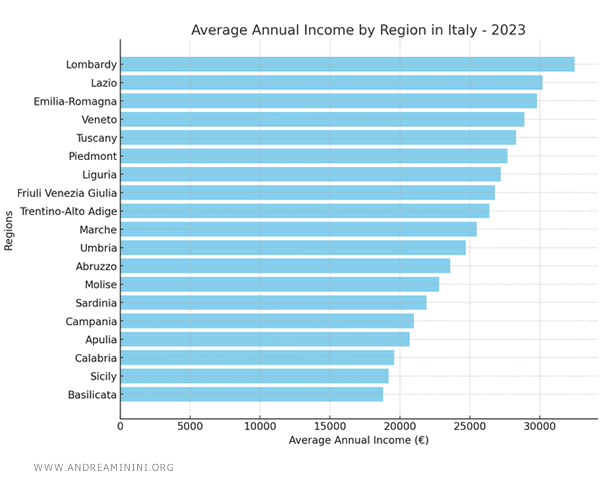
- Territorial Series (or Geographic Series)
Data collected from different locations or regions to compare the phenomenon across various areas.
Example. Consider data on average income across different regions of a country. This territorial series displays the distribution of average annual income in various Italian regions for 2023. The regions are listed from Lombardy, with the highest average income, to Basilicata, with the lowest.
Region Average Annual Income (€) Lombardy 32,500 Lazio 30,200 Emilia-Romagna 29,800 Veneto 28,900 Tuscany 28,300 Piedmont 27,700 Liguria 27,200 Friuli Venezia Giulia 26,800 Trentino-Alto Adige 26,400 Marche 25,500 Umbria 24,700 Abruzzo 23,600 Molise 22,800 Sardinia 21,900 Campania 21,000 Apulia 20,700 Calabria 19,600 Sicily 19,200 Basilicata 18,800 This series can be used to analyze economic disparities between Italian regions, identify areas in need of economic support or development policies, or compare income trends over time across regions. This series could also be represented with a bar chart to immediately highlight income differences between the regions.
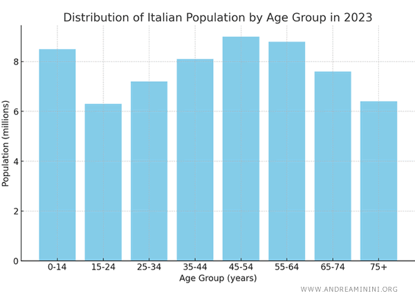
- Class Series
Data grouped into classes or categories to show the distribution of a phenomenon. For example, population distribution by age group.Example. This class series shows the distribution of the Italian population in 2023, categorized by age group. Each age group covers a range of years and indicates how many millions of people fall within that specific category.
Age Group (years) Population (millions) 0-14 8.5 15-24 6.3 25-34 7.2 35-44 8.1 45-54 9.0 55-64 8.8 65-74 7.6 75+ 6.4 This series can be used to analyze a country's demographic structure, understand the relative size of different age groups within the total population, and plan targeted public policies, such as resource allocation for education or elderly care. The distribution could also be visualized with a histogram to graphically represent the proportion of each age group relative to the total population.
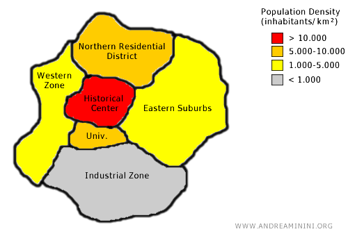
- Spatial Series
Similar to a territorial series, but focused on the distribution of a phenomenon within a specific physical space, such as population density in different parts of a city.Example. This spatial series represents the population density in various areas of a city in 2023. The zones are classified based on their intended use (historical, residential, industrial, etc.), with population density calculated as the number of inhabitants per square kilometer.
City Zone Area (km²) Population Population Density (inhabitants/km²) Historical Center 5 75,000 15,000 Northern Residential District 12 60,000 5,000 Industrial Zone 20 10,000 500 Eastern Suburbs 30 45,000 1,500 University District 8 40,000 5,000 Western Commercial Zone 15 25,000 1,666 This spatial series can be used to understand how the population is distributed within the city and to plan urban development, such as the construction of new infrastructure, the allocation of public services, or traffic management. The series could also be visualized with a thematic map, where each zone of the city is color-coded based on population density, allowing for an immediate visual understanding of the spatial distribution of the population.
And so on.