Equal-Width Histograms
An equal-width histogram is a histogram in which all class intervals have the same width, and the height of each bar represents the absolute or relative frequency of the corresponding class.
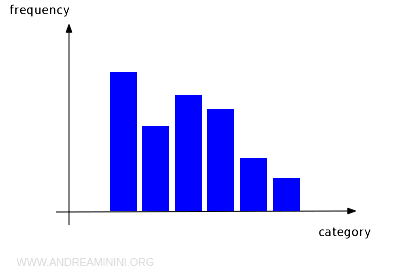
The horizontal axis is divided into equal-width intervals, each representing a class of values. A bar is drawn over every interval, and its height shows how many observations fall within that class.
Equal-width histograms are among the most commonly used tools in statistics because they provide a quick and intuitive way to visualize the distribution of a quantitative variable.
Two characteristics define an equal-width histogram:
- All Class Intervals Have the Same Width
Every class covers the same range of values. As a result, all bars have the same base width along the horizontal axis. - Bar Heights Represent Frequencies
Since the class intervals are equally wide, the frequency of each class can be read directly from the height of its bar. A class containing twice as many observations as another will have a bar that is twice as high.
This uniform structure makes comparisons straightforward. By simply looking at the heights of the bars, you can immediately identify the most and least common classes.
How does an equal-width histogram differ from a histogram with unequal class widths? In an equal-width histogram, all classes have the same width, so frequencies can be compared directly using bar heights. In a histogram with unequal class widths, however, the area of each bar, rather than its height alone, must be proportional to the frequency. For this reason, the vertical axis typically displays frequency density instead of frequency.
A Practical Example
Suppose we want to analyze the height distribution of a group of people.
The data are grouped into equal-width class intervals, such as 150-160 cm, 160-170 cm, and so on.
| Height Range (cm) | Frequency |
|---|---|
| 150-160 | 5 |
| 160-170 | 12 |
| 170-180 | 8 |
| 180-190 | 4 |
| 190-200 | 1 |
Once the data are plotted in an equal-width histogram, the distribution becomes much easier to interpret.
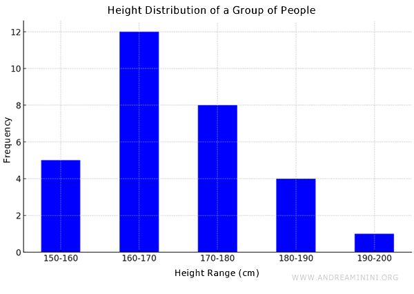
The class intervals are displayed along the horizontal axis, while the corresponding absolute frequencies appear on the vertical axis.
At a glance, it is clear that the 160-170 cm interval is the most common class because its bar is the tallest. The frequencies then decrease for the taller height ranges, producing the overall shape of the distribution.
Note: Histograms are usually displayed with vertical bars, but they can also be drawn horizontally. In that case, the class intervals appear on the vertical axis and the frequencies on the horizontal axis.
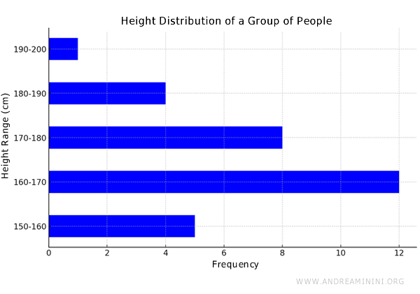
In a horizontal histogram, the longest bar corresponds to the class with the highest frequency.
And so on.