Cartograms
Cartograms are a type of map used to visually represent data for specific geographic areas, with the size or shape of the regions distorted based on the data being displayed.
To create a cartogram, a geographical map is used, and regions are marked with colors or symbols according to the data being represented.
By using these colors and symbols, cartograms make it easy to grasp key information at a glance.
Note: Cartograms are commonly found in geography textbooks and atlases because they provide a quick, visual way to understand complex data. They’re also widely used in fields like economics and demography. At times, the geographic maps in a cartogram are intentionally distorted to emphasize areas that hold greater significance in the data. These are known as value cartograms. Rather than preserving geographic accuracy, this type of cartogram adjusts the size of regions based on the data being represented.
Practical Example
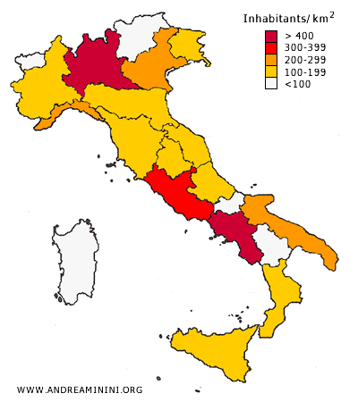
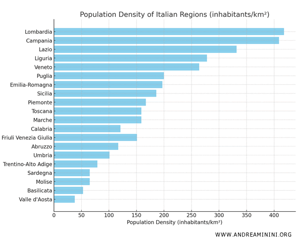
Here’s a table showing the population density of different regions in Italy:
| Region | Area (km²) | Population | Density (inhabitants/km²) |
|---|---|---|---|
| Lombardy | 23,862 | 10,020,528 | 418 |
| Campania | 13,668 | 5,590,076 | 409 |
| Lazio | 17,236 | 5,720,272 | 332 |
| Liguria | 5,418 | 1,508,847 | 278 |
| Veneto | 18,351 | 4,851,972 | 264 |
| Apulia | 19,541 | 3,890,250 | 200 |
| Emilia-Romagna | 22,502 | 4,455,188 | 197 |
| Sicily | 25,824 | 4,794,512 | 186 |
| Piedmont | 25,392 | 4,252,581 | 167 |
| Tuscany | 22,985 | 3,664,798 | 159 |
| Marche | 9,345 | 1,484,427 | 159 |
| Calabria | 15,213 | 1,838,150 | 121 |
| Friuli Venezia Giulia | 7,937 | 1,195,792 | 151 |
| Abruzzo | 10,829 | 1,269,963 | 117 |
| Umbria | 8,464 | 854,378 | 101 |
| Trentino-Alto Adige | 13,606 | 1,082,116 | 79 |
| Sardinia | 24,106 | 1,569,832 | 65 |
| Molise | 4,460 | 289,413 | 65 |
| Basilicata | 10,072 | 533,636 | 53 |
| Aosta Valley | 3,259 | 123,018 | 38 |
This table displays the population density of Italian regions, along with their area and population figures.
Each row corresponds to a region, with the respective data shown in the columns.
This is a type of territorial series since the categories represented are geographical regions.
While it's possible to display population density using a bar chart, this would remove the geographic context of the regions. For instance, how would you know which regions are in Southern Italy? A bar chart wouldn’t convey this. Anyone unfamiliar with Italy would need to look that information up elsewhere.
A better way to represent this data is with a cartogram based on a map of Italy, where regions with higher population density are colored in red, and those with lower density are shaded in light gray or white.
This allows the viewer to instantly see the geographic differences, where regions are located, and quickly understand where the population is most concentrated.
Pros and Cons of Cartograms
Advantages of Cartograms
The biggest advantage of cartograms is their ability to visually communicate complex data in a clear and intuitive way.
At a glance, a cartogram shows how a statistical variable (like population density or income) is distributed across space, transforming otherwise difficult-to-interpret numbers into a format that is visually straightforward.
The visual impact is key for conveying complex information simply and effectively.
They also provide a broad overview that can be easily understood, even by non-experts.
Disadvantages of Cartograms
A challenge with cartograms is representing very small regions or areas with extremely low values relative to others. These areas can become so minimized that they are nearly invisible.
Additionally, cartograms work best when there are only a few distinct data categories. If there are many categories or minimal variation between areas, the cartogram may become cluttered and lose its clarity.
Finally, compared to simpler visualizations like bar charts, cartograms require more time and resources to produce.
And so on.