Histogram
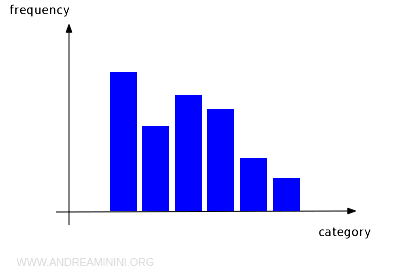
A histogram (or bar chart) is a type of graph that visually represents the distribution of data using bars.
- If all the bars have the same width, the height of each bar corresponds to the frequency of the data in that interval. This type is also known as an orthogram.
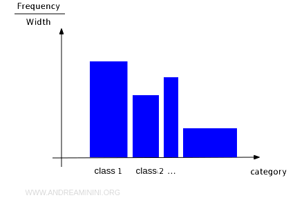
- If the bars have varying widths, it's the area of the bar, rather than the height, that represents the frequency.
Histograms provide a quick and clear way to visualize how data is distributed.
For instance, if most of the bars are grouped toward one side of the graph, it suggests that the data distribution is skewed.
There are two main types of histograms: those with fixed-width bars (orthograms) and those with variable-width bars.
Orthogram
When the bars in a histogram have equal widths, the graph is referred to as an orthogram.
In this case, the height of each bar is directly proportional to the frequency of data within that specific interval.
This type of graph is very common, making it easier to read and interpret the data distribution visually.
For example, if most of the bars are concentrated on one side of the graph, it indicates an asymmetric data distribution. If the bars form a symmetrical curve, it might suggest that the data follows a normal distribution.
Example
Consider the average weight of packages shipped by an e-commerce company over a month.
| Interval (kg) | Frequency |
|---|---|
| 0 - 2 | 10 |
| 2 - 4 | 14 |
| 4 - 6 | 9 |
| 6 - 8 | 7 |
| 8 - 10 | 5 |
| Total | 45 |
The first column shows the weight intervals of the shipments, with all intervals having the same width.
The second column represents the frequency, or the number of shipments within each weight interval.
In this case, the height of the histogram bars is proportional to the frequency of each class since all classes have equal width.
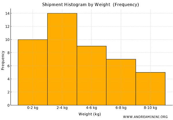
As you can clearly see, the bars in the histogram all have the same width.
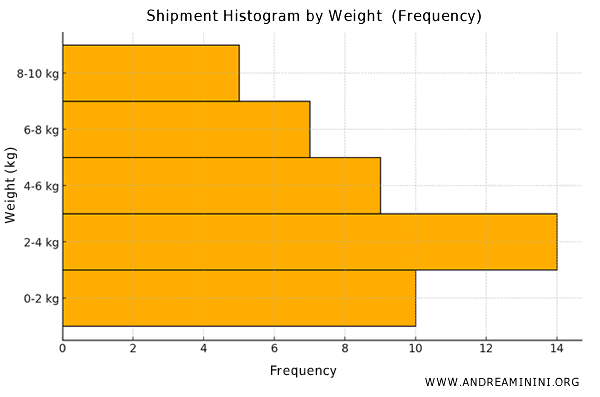
Note: A histogram can also be represented with the frequency on the horizontal axis and the classes on the vertical axis. In this orientation, the bars extend horizontally, with the length corresponding to the frequency rather than the height. Regardless of the orientation, all the bars maintain the same vertical width (base).
Histogram with Variable Widths
When the bars in a histogram have different widths, the frequency of each class is represented by the area of the bar.
In this case, the height of the bars alone cannot be used to compare frequencies.
To accurately compare the frequencies, you need to consider the total area of each bar, which is proportional to the frequency of the interval represented.
Note: A short but wide bar could represent a higher frequency than a tall but narrow bar, or vice versa. Therefore, in this context, the height of the bar no longer directly indicates frequency.
When bar widths vary, the height of the bars is calculated by dividing the frequency by the width of the interval. This calculation yields what is known as frequency density.
$$ \text{Frequency Density} = \frac{\text{Frequency}}{\text{Interval Width}} $$
In practice, frequency density is the value represented by the height of the bar, ensuring that the area of each bar remains proportional to the frequency.
Example
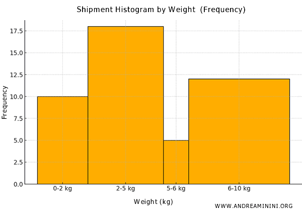
Let's consider the average weight of packages shipped by an e-commerce company over a month.
| Interval (kg) | Frequency |
|---|---|
| 0 - 2 | 10 |
| 2 - 5 | 18 |
| 5 - 6 | 5 |
| 6 - 10 | 12 |
| Total | 45 |
The first column shows the weight intervals of the shipments, with varying interval widths.
The second column (frequency) indicates the number of shipments within each weight interval.
In this case, since the intervals have different widths, you first need to calculate the frequency density for each class to create the histogram.
For example, the 0-2 kg interval has a width of 2 and a frequency of 10. Therefore, the frequency density is 5.
$$ \text{Frequency Density} = \frac{10}{2} = 5 $$
For the 2-5 kg interval, the frequency density is 6.
$$ \text{Frequency Density} = \frac{18}{3} = 6 $$
For the 5-6 kg interval, the frequency density is 5.
$$ \text{Frequency Density} = \frac{5}{1} = 5 $$
For the 6-10 kg interval, the frequency density is 3.
$$ \text{Frequency Density} = \frac{12}{4} = 3 $$
Let's add an additional column to the table to include the frequency density.
| Interval (kg) | Frequency | Frequency Density |
|---|---|---|
| 0 - 2 | 10 | 5 |
| 2 - 5 | 18 | 6 |
| 5 - 6 | 5 | 5 |
| 6 - 10 | 12 | 3 |
| Total | 45 |
Finally, I'll draw the histogram, using the frequency density for each class on the vertical axis.
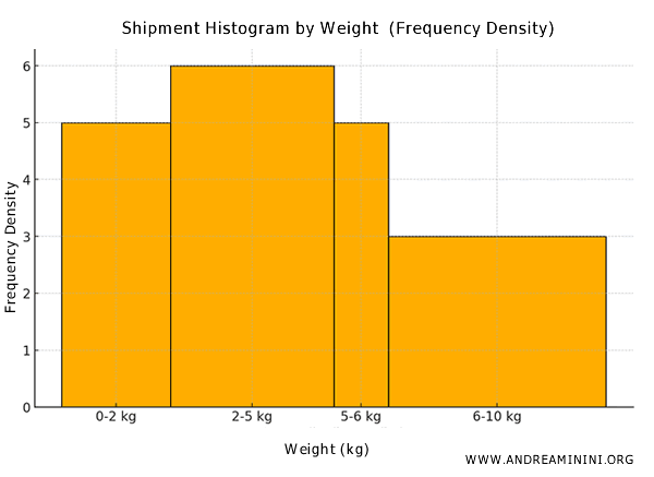
This method ensures that even with varying interval widths, the area of each bar accurately represents the data frequency thanks to the frequency density calculation.
For example, the area of the first bar is 2×5=10, which matches the frequency of the 0-2 kg class. Similarly, the area of the second bar is 3×6=18, matching the frequency of the 2-5 kg class, and so on.
This approach is crucial for maintaining a precise and consistent representation of the data distribution.
Note: If you were to use the raw frequencies of the classes instead of the frequency density, the 6-10 kg class might appear taller than the 0-2 kg and 5-6 kg classes, which would distort the graphical interpretation of the data.
And so forth.