Cartesian Graph
A Cartesian graph is a graphical tool used to visualize the relationship between two statistical variables on a plane, known as the Cartesian plane.
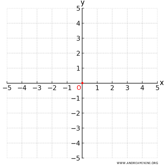
To construct a Cartesian graph, assign each variable to one of the axes:
- Horizontal axis (x-axis or abscissa)
The x-axis represents one of the variables. - Vertical axis (y-axis or ordinate)
The y-axis represents the other variable.
Both axes are marked with arrows indicating their direction and meet at a point called the origin (O) of the graph.
Note: The x-axis usually represents the independent variable, like time or distance, while the y-axis shows the dependent variable, which changes based on the x-axis variable.
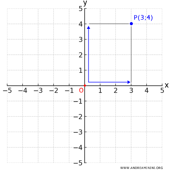
Each point P on the graph is identified by a pair of numerical values (x, y), known as the Cartesian coordinates, which indicate how far the point is from the origin along both the x and y axes.
For example, if a point has the coordinates (3, 4), it means you move 3 units to the right on the x-axis and 4 units up on the y-axis.
A Practical Example
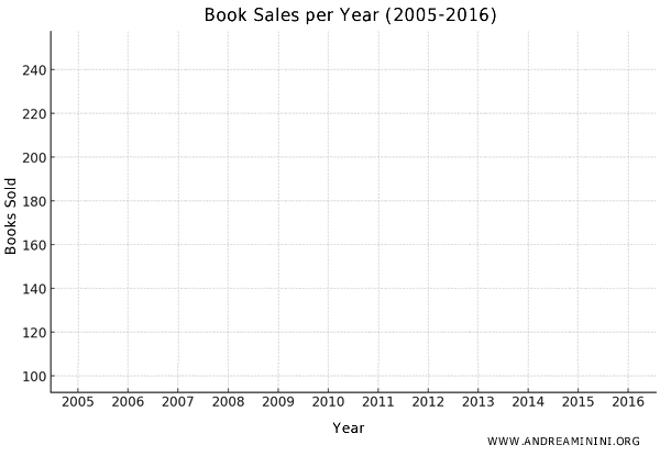
Let’s say I want to represent the sales of a bookstore over several years on a Cartesian graph.
Here’s the sales data for each year:
| Year | Books Sold |
|---|---|
| 2005 | 120 |
| 2006 | 140 |
| 2007 | 160 |
| 2008 | 130 |
| 2009 | 180 |
| 2010 | 150 |
| 2011 | 170 |
| 2012 | 100 |
| 2013 | 220 |
| 2014 | 190 |
| 2015 | 210 |
| 2016 | 250 |
Now, I’ll start constructing the Cartesian graph.
First, I assign the variables to the axes:
- The x-axis (horizontal) represents the years from 2005 to 2016.
- The y-axis (vertical) represents the number of books sold each year.
Note: It’s essential to clearly label which variables are represented on each axis. Without this, the graph loses its meaning. This is a common mistake, but one that can be particularly serious in an exam context.
Each point on the graph corresponds to a pair of coordinates (x, y), where:
- The $ x $ variable represents the year.
- The $ y $ variable represents the number of books sold.
Based on the data from the table, the Cartesian coordinates for each year are as follows:
- (2005, 120) for the year 2005
- (2006, 140) for the year 2006
- (2007, 160) for the year 2007
- (2008, 130) for the year 2008
- (2009, 180) for the year 2009
- (2010, 150) for the year 2010
- (2011, 170) for the year 2011
- (2012, 100) for the year 2012
- (2013, 220) for the year 2013
- (2014, 190) for the year 2014
- (2015, 210) for the year 2015
- (2016, 250) for the year 2016
I plot these points on the Cartesian graph.
For instance, the pair (2005, 120) represents a point that corresponds to the year 2005 on the x-axis and 120 sales on the y-axis.
This set of points forms a scatter plot.
To clarify the trend, I can connect the adjacent points with a line.
This creates a line graph, also known as a frequency polygon, which shows how sales have fluctuated over time.
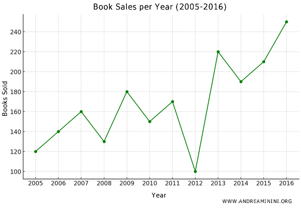
Such a graphical representation makes it easier to interpret the trend and understand the changes over time.
In particular, it’s very useful for representing a time series of data.
For example, looking at the graph, I can clearly see how book sales fluctuate. Here, there’s a noticeable overall increase, despite a sharp drop in 2012. This observation could lead to an investigation of the reasons behind the 2012 decline.
Alternatively, I can highlight each point by drawing vertical lines corresponding to the y-values.
This type of Cartesian graph is known as a segment diagram.
And that’s the process.