Pie Charts
A pie chart (or aerogram) is a graphical tool used to display the percentage distribution of different categories within a dataset. It’s also referred to as a circular chart.
The entire circle represents 100% of the categories or options, with each slice corresponding to the percentage of a particular category.
Each slice of the pie is proportional to the frequency of the category it represents, showing how much that category contributes to the total.
This allows you to quickly and clearly see how the data is divided.
How is the size of each slice calculated? The size of each slice is determined by multiplying the category's percentage by 360°, the total angle of the circle. $$ x:360° = f : 100 $$ where $x$ is the size of the slice, and $f$ is the frequency of the category.
Practical Example
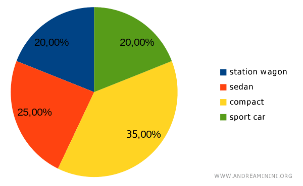
Let’s consider the car preferences of a group of people.
The percentages of preference are as follows:
- Station Wagon: 20%
- Sedan: 25%
- Compact: 35%
- Sports Car: 20%
I need to create a pie chart to represent these preferences.
First, I convert these percentages into pie slices by calculating the central angle for each:
- Station Wagon: 20% of the circle, so 0.20 · 360° = 72°
- Sedan: 25% of the circle, so 0.25 · 360° = 90°
- Compact: 40% of the circle, so 0.35 · 360° = 126°
- Sports Car: 20% of the circle, so 0.20 · 360° = 72°
The result is a pie chart divided into four slices, representing the preferences of the group for station wagons, sedans, compacts, and sports cars.
Since compact cars account for 35% of the preferences, they take up the largest slice, while station wagons and sports cars, each with 20%, take up smaller slices.
In a pie chart, each slice is proportional to the corresponding percentage.
For instance, the orange slice (compact cars) represents 25% of the preferences. To calculate the central angle of this slice, we use the following proportion:
$$ x:360° = 25 : 100 $$
Where 360° represents the full circle, or the total population.
$$ x = \frac{25}{100} \cdot 360 = \frac{25 \cdot 36}{10} = \frac{900}{10} = 90° $$
This means the orange slice has a central angle of 90°.

The same method can be used to calculate the angles for the other slices.
The sum of all the angles in a pie chart will always equal 360°.
When Should You Use a Pie Chart?
Pie charts are particularly useful when you need to visually represent the percentage breakdown of a categorical variable.
They’re simple, clear, and easy to interpret, especially when comparing the relative sizes of different categories.
However, they’re best used with only a few categories, as too many slices can make the chart harder to read.
And so on.