Radar Chart
A radar chart is a visualization tool used to display multiple variables along distinct axes that all originate from a central point.
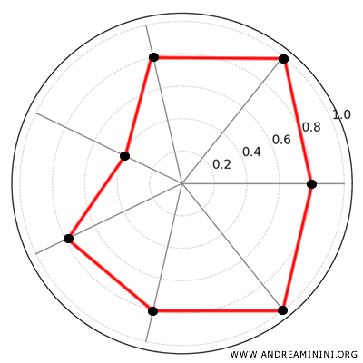
It’s also referred to as a spider chart, spider graph, Kiviat diagram or polar chart.
Radar charts are particularly useful for comparing values across multiple variables or for visualizing cyclical data patterns, such as weekly or monthly trends.
The basic components of a radar chart include:
- Center Point: The point from which all the axes radiate. It usually serves as the origin (O) for all axes.
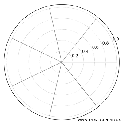
- Axes: A radar chart has as many axes as there are variables to plot. These axes are arranged in a circular layout, extending outward from the center. The angles between consecutive axes are equal. For instance, if the chart has 6 axes, the full circle of 360 degrees is divided by 6, resulting in an angle of 60° between each pair of axes.
- Values on the Axes: Each axis represents a variable or category, and the values for each variable are plotted along the length of the axis. These values can be represented on the same scale or on different scales (linear or logarithmic), depending on the data.
- Polygon: The values on the axes can be connected by straight lines, forming a polygon. This polygon visually illustrates the relationships or patterns among the variables.
Note: Radar charts are highly effective when you need to visualize relationships between multiple variables, especially when the data exhibits a cyclical pattern. They are ideal for comparing multiple data sets and for showing how different variables behave in relation to one another. However, it’s important to use them carefully to avoid making the chart too complex, particularly when many variables or overlapping series are involved.
A Practical Example
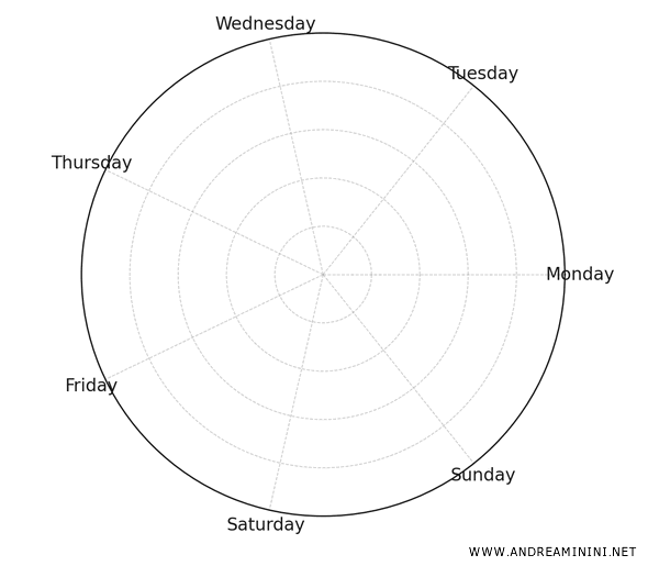
Let’s consider the sales of product A over the course of a week:
| Day | Sales (kg) |
|---|---|
| Monday | 150 |
| Tuesday | 200 |
| Wednesday | 170 |
| Thursday | 220 |
| Friday | 180 |
| Saturday | 300 |
| Sunday | 250 |
First, I identify the variable I want to represent.
In this case, it’s a time series of one variable (the sales of product A), and the goal is to compare sales performance across different days of the week.
As a result, the radar chart will have 7 axes, one for each day of the week, spaced equally around the chart in a radial layout (like spokes of a wheel).
I plot the sales figures for each day on their respective axes, using a uniform scale to facilitate comparison.
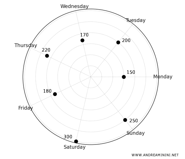
Once the values are plotted, I connect the points with straight lines to form a polygon.
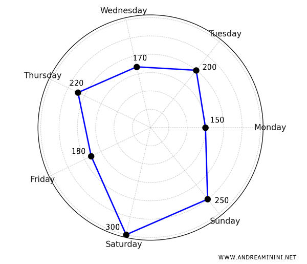
This polygon provides a visual representation of the sales trend for product A throughout the week.
It’s immediately clear that sales are highest on the weekend, with noticeable dips on Monday and Friday.
Example 2
Radar charts can also be used to compare multiple variables or product attributes (such as quality, price, reliability, etc.).
For example, I want to compare the sales trends of two products, A and B, over the course of the week.
| Day | Sales (A) | Sales (B) |
|---|---|---|
| Monday | 150 | 290 |
| Tuesday | 200 | 270 |
| Wednesday | 170 | 250 |
| Thursday | 220 | 200 |
| Friday | 180 | 190 |
| Saturday | 300 | 150 |
| Sunday | 250 | 100 |
In this case, the radar chart will display two data sets: the sales of product A and the sales of product B.
The result will be two polygons.
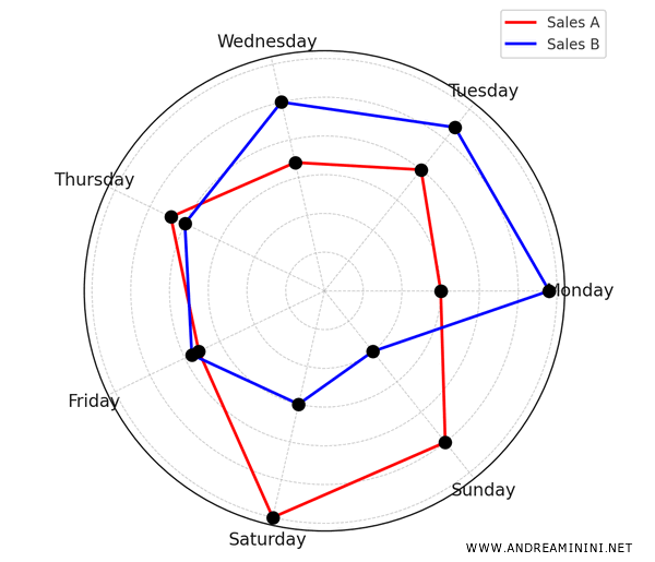
By examining the radar chart, I can easily compare the sales of both products.
In this example, it's clear that product A's sales (in red) peak during the weekend, whereas product B's sales (in blue) are strongest at the beginning of the week.
Advantages and Disadvantages of Radar Charts
Like any tool, radar charts have both advantages and disadvantages.
- Advantages
Radar charts provide a clear way to visualize multiple variables simultaneously. They are particularly effective at highlighting patterns or trends in data, such as dips or peaks over time. Additionally, they make it easy to compare different aspects of a phenomenon or to contrast multiple phenomena. - Disadvantages
However, radar charts can become hard to read if too many variables or data sets are plotted, as overlapping polygons can make the chart look cluttered. They are also not ideal for representing data with large value ranges, as differences in scale may be difficult to interpret. Generally, they may not be the best option if you need a highly detailed view or if you want to focus on just one variable at a time.
And so on.