Descriptive Statistics
Descriptive statistics is the field of statistics that deals with the methods for organizing, presenting, and summarizing data.
Describing Data
Statistical data only becomes useful when it's presented clearly and effectively.
There are several techniques for representing data:
- Tables
These are grids that arrange data systematically, making it easy to compare figures or information at a glance. - Cross-Tabulation Tables
Cross-tabulation tables are used to analyze the relationship between two variables. Data sets are arranged with one variable across the rows and the other across the columns. These tables enhance the interpretation of results by clearly illustrating how changes in one variable correspond to variations in the other. - Bar Graphs (or bar charts)
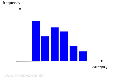
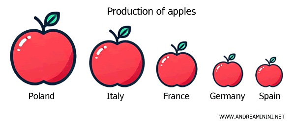
Bar graphs visually represent numerical data using vertical or horizontal bars with a consistent base. The length of each bar corresponds to the value it represents, making it easy to compare different data points. In other words, the bars extend in height or width to illustrate the relative size of each value.
- Histograms
Histograms are a type of bar chart where the width of each bar can vary. Here, the value is represented by the area of the bar rather than just its height.
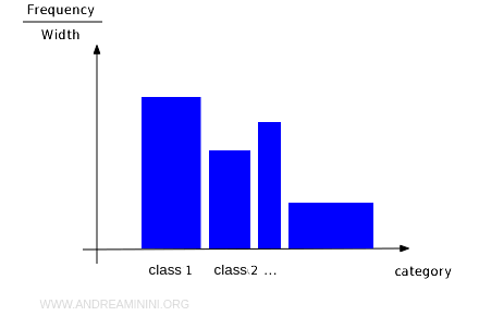
Difference between a Histogram and a Bar Graph. A bar graph is a specific type of histogram where all the bars have the same width. In bar graphs, only the height is proportional to the value being represented.
- Cartesian graphs (Line graphs)
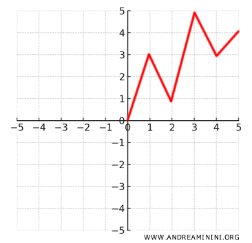
These graphs use lines to connect a series of data points, making them ideal for showing trends over time or relationships between two variables. They are particularly effective for tracking changes over time or seeing how two factors correlate.
- Pie charts
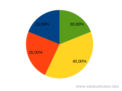
These circular charts display the relative proportions of different categories of data, with each slice representing a percentage of the whole. Pie charts are especially useful for illustrating how something is divided among various categories.
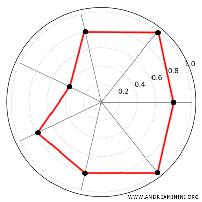
- Radar Chart (Spider Graph or Polar Chart)
A radar chart is a circular diagram used to visualize multiple variables along distinct axes that radiate from a central point. Each variable is plotted on its own axis, and the values are connected by lines to form a polygon. This chart is particularly well-suited for comparing cyclical data or time series, such as weekly or monthly sales, as well as performance across different domains. It’s also a valuable tool for drawing comparisons and uncovering relationships between two different phenomena.
- Ideograms
These are graphic symbols used to represent concepts, objects, or actions in a simple and visual way. Commonly used in signage or logographic writing, ideograms are intuitive and can be understood across different languages.
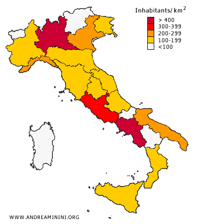
- Cartograms
These are maps where the size of areas is adjusted to reflect a specific variable, such as population or density, with geography distorted to emphasize the data. Essentially, cartograms are specialized maps that alter the shapes of regions to better illustrate key information, such as how many people live in a city or the prevalence of a particular phenomenon.
Each representation method has its own strengths and weaknesses.
The effectiveness of a particular method depends on the specific statistical phenomenon you're trying to represent.
As a result, there's no universally optimal way to represent data; the best method varies depending on the context.
Summarizing Data
Statistical data sets are often too large to interpret at a glance.
To convey the information within the data more effectively, we use summarization tools.
The most commonly used summarization tools include:
- Mean
- Median
- Mode
These tools provide a representative value for a given data set.
To assess how well these summaries capture the data, we also use measures of dispersion:
- Variance
- Standard deviation
- Percentiles
These measures help determine how accurately a summary (like the mean) represents the overall distribution of the data.