Feynman Diagram
A Feynman diagram is a schematic representation of how elementary particles interact, as described by quantum mechanics and gauge theories such as QED and QCD.
It is not a literal picture of what “really happens” in space-time.
Instead, it’s a tool that lets physicists carry out calculations in quantum field theory without getting lost in a jungle of daunting integrals.
Why is it useful?
A Feynman diagram is powerful because, at a glance, it reveals which particles are involved, which fundamental forces are at work (electromagnetic, strong, weak), and what the outcome of the process is.
How it works
The first step is to choose which axis represents the passage of time - either horizontal or vertical.
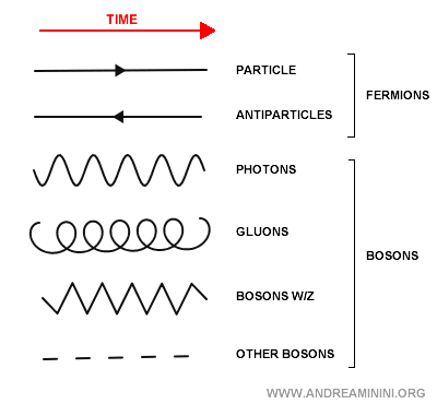
The diagram uses specific conventions to depict particles and their interactions:
- Straight lines with arrows. These represent matter particles (fermions) such as quarks or electrons. If the arrow points in the same direction as time, it indicates a particle; if it points the other way, it indicates an antiparticle.
- Wavy lines. These represent force carriers (bosons) such as photons, gluons, or W/Z bosons. The bosons exchanged in a diagram are typically virtual - they don’t exist as free particles but only as intermediaries of the interaction.
- Vertices. Vertices are the points where particles meet and exchange bosons. They represent interactions that obey the conservation laws of energy, momentum, charge, and so on. More complex diagrams have many vertices, while simpler ones may have only a few.
Each line and vertex corresponds to a precise mathematical term in an equation. A Feynman diagram is, in essence, a visual bookkeeping system for particle interactions.
Note. In Feynman diagrams, the arrangement of lines is not meant to represent actual particle positions in space. It only shows which particles enter and which emerge from the process. The only element with physical meaning is the chosen direction of time (horizontal or vertical, depending on the convention).
A practical example
In this diagram, the horizontal axis represents time. Moving from left to right means going from the past to the future.
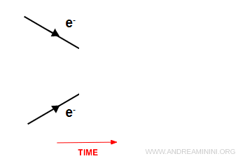
On the left, we start with two electrons ( $ e^- $ ). That’s the initial state of the process.
As we move forward in time, the two electrons approach one another.
The converging arrows don’t represent actual spatial distance. They simply indicate that the particles are interacting.
The electrons exchange a virtual photon, shown as the wavy line in the center.
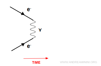
The photon is the mediator of the electromagnetic force - it effectively “tells” the electrons to repel one another.
Further to the right (later in time), the two electrons emerge moving apart.
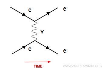
Again, the arrows don’t indicate literal motion through space. The diagram simply shows that two electrons enter the interaction and two electrons exit.
This is the simplest case of electron - electron scattering.
Note. The same process could just as well be drawn with time running vertically, from bottom (past) to top (future). That was, in fact, the more traditional convention.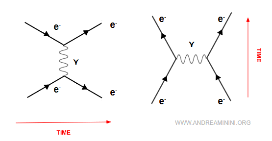
Example 2
Bhabha scattering is an elastic collision between an electron and a positron:
$$ e^- + e^+ \;\;\longrightarrow\;\; e^- + e^+ $$
The electron and positron annihilate into a virtual photon, which immediately produces a new $e^- + e^+$ pair.
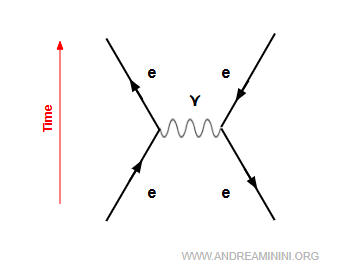
In this case, the outgoing lines represent an electron (arrow pointing forward in time) and a positron (arrow pointing backward in time).
The diverging arrows don’t imply that the particles are literally flying apart - in fact, they attract each other. The arrows only encode the structure of the interaction.
And so on.